Using Svelte as a prototyping tool
Some time ago I started fooling around with Svelte after hearing a lot from it on Twitter, and so my journey began. Since my time was rather limited I decided to stick to the basics and intended to try and build a simple one-pager with it.
What makes Svelte stand out is that it does most of the work at compile time and not in the browser. Which in human language means, it outputs flat HTML and no JavaScript components whatsoever.
Svelte is a radical new approach to building user interfaces. Whereas traditional frameworks like React and Vue do the bulk of their work in the browser, Svelte shifts that work into a compile step that happens when you build your app. — svelte.dev
This post will walk you trough the basics of Svelte and you will have created a one-pager yourself at the end of it.
Getting started permalink
By default Svelte can do a lot of things out of the box and it’s very easy to start making your own components. Let’s start our prototyping example.
npx degit sveltejs/template prototyping-with-svelte
cd prototyping-with-svelte
npm install
npm run dev
If everything went well, the template will be served on localhost:5000. In case you are wondering what degit is, this is a project scaffolding tool. Next to using degit to get started it’s also possible to use the REPL.
Project structure is as straightforward as it can get. There’s a src folder which contains main.js and App.svelte.
main.js is the entry point of the application and App.svelte is the root component.
The first component permalink
The Hello World! example is a bit empty, so we’ll add more resources to it. Create a ResourceCard.svelte file in src/components and add the following code to it.
<script>
    export let title;
    export let href;
    export let tags;
</script>

<a class=“resource-card” {title} {href}>
    <strong class=“resource-card__title">{title}</strong>
    {#each tags as tag, i}
    <span class=“resource-card__tag">{tag}</span>
    {/each}
</a>

<style>
    .resource-card {
        margin: 1em 0;
        padding: 1em;
        border: 1px solid #ccc;
        display: block;
    }

    .resource-card__title {
        margin-bottom: 0.5em;
        padding-bottom: 0.5em;
        border-bottom: 1px solid #ccc;
        display: block;
    }

    .resource-card__tag {
        margin: 0 0.2em 0.4em 0;
        padding: 0.3em 0.5em;
        border: 1px solid #ccc;
        background-color: #fefefe;
        display: inline-block;
    }
</style>
As you can see both the HTML markup, styling and script are present in the same file. Personally I’m not a big fan of that and for that reason I will later on show you how I excluded the styling from the components to create a shared CSS codebase.
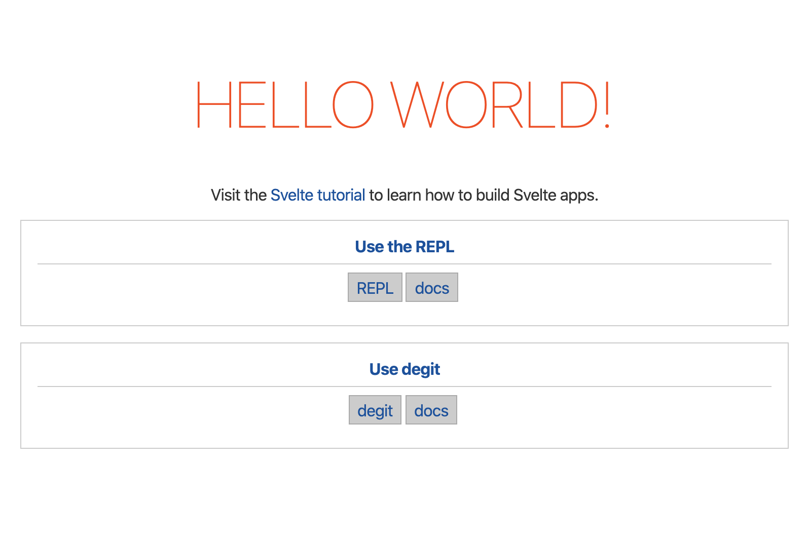
Before we’ll be able to use our ResourceCard component we'll need to import it in our App.svelte component and provide data for it.
<script>
    import ResourceCard from './components/ResourceCard.svelte';

    let resources = [
        { title: 'Use the REPL', href: 'https://svelte.dev/blog/the-easiest-way-to-get-started#1_Use_the_REPL', tags: ['REPL', 'docs']},
        { title: 'Use degit', href: 'https://svelte.dev/blog/the-easiest-way-to-get-started#2_Use_degit', tags: ['degit', 'docs']}
    ];
</script>
We’ll need to loop over the resources array and provide the values as props to the component.
{#each resources as { title, href, tags}, i}
<ResourceCard {title} {href} {tags} />
{/each}
When the variable or key has the same name as the prop you're assigning it to you can use the {sameName} syntax instead of using prop={propValue}.
{#each resources as { title, href, tags}, i}
<ResourceCard title={title} href={href} tags={tags} />
{/each}
It’s also possible to use the spread operator.
{#each resources as resource, i}
<ResourceCard {...resource} />
{/each}
Rendering this gives us something that looks like this:
Adding Sass support permalink
I’m a big fan of Sass, Atomic Design and BEM so I can write reusable CSS. I decided to look up how to integrate Sass and after a little bit of digging around I found a solution.
First we'll need to install some extra dependencies.
npm i -D svelte-preprocess autoprefixer node-sassNext in our rollup.config.js file, import svelte-preprocess and create a configuration.
import sveltePreprocess from 'svelte-preprocess';

...

const preprocess = sveltePreprocess({
    scss: {
        includePaths: ['src'],
    },
    postcss: {
        plugins: [require('autoprefixer')],
    },
});
Now the only thing that remains is adding our preprocess config to the svelte config in the plugins array.
plugins: [
    svelte({
        // enable run-time checks when not in production
        dev: !production,

        // we'll extract any component CSS out into
        // a separate file - better for performance
        css: css => {
            css.write('public/build/bundle.css');
        },

        // Process all SCSS files
        preprocess
    }),
    ...
]
Now to make use of Scss all we have to do is add lang="scss" to the style-tag and refactor some of the CSS we wrote.
<style lang=“scss">
    .resource-card {
        margin: 1em 0;
        padding: 1em;
        border: 1px solid #ccc;
        display: block;

        &__title {
            margin-bottom: 0.5em;
            padding-bottom: 0.5em;
            border-bottom: 1px solid #ccc;
            display: block;
        }

        &__tag {
            margin: 0 0.2em 0.4em 0;
            padding: 0.3em 0.5em;
            border: 1px solid #ccc;
            background-color: #fefefe;
            display: inline-block;
        }
    }
</style>
Excluding styles from components permalink
For maintainability and scalability I personally prefer my styles to be more centralised. For that reason I will create a _resource-card.scss file in src/styles and move all the styles in the style tag in the ResourceCard component to that file. In our component we replace our styles with the import to our newly created file. Note that I used an underscore character to mark our component styling as a partial.
<style lang="scss">
    @import '../styles/resource-card';
</style>
Our app structure now should look something like this.
src
+-- styles
    +-- _resource-card.scss
+-- components
    +-- ResourceCard.svelte
+-- App.svelte
+-- main.js
Now let’s add some base variables in _base.scss and create a main.scss file to load in our Scss.
src
+-- styles
    +-- _base.scss
    +-- _resource-card.scss
    +-- main.scss
+-- components
    +-- ResourceCard.svelte
+-- App.svelte
+-- main.js
Our _base.scss file can be used to store all sort of base variables in such as colors, typography, spacing, e.g. But we'll keep it simple and stick with just three.
$primary-color: #ff3e00;
$font-size: 1em;
$border-color: #ccc;
Our main.scss will be used to import and manage all other Scss resources we need (and sometimes, some configurations and CSS resets).
// Base
@import 'base';

// Components
@import 'resource-card';
Now remove the style tag from the ResourceCard component and:
- Replace all occurrences of
#cccwith$border-colorin_resource-card.scss. - Move the styles from
App.sveltetomain.scssbelow the imports and replace#ff3e00within theh1selector styles with$primary-color;
Alright, this gives us the following!

But wait a minute? Where did our styling go? Let’s fix this by importing main.scss in App.svelte.
<style lang="scss">
    @import 'styles/main’;
</style>
Hm? Where did our styling go for our ResourceCard component? Well, styles that are added in a component — here App.svelte — are scoped to that component. So we will need to add the global attribute to the style-tag to fix this.
<style lang="scss" global>
    @import 'styles/main';
</style>
Note: When building large scale applications you may actually want to leverage the scoped styling options Svelte offers.
So what did we do so far?
- Created our first component called ResourceCard.
- Added Scss to the build.
- Moved the component styling to a Scss partial.
- Created a base file that contains base variables.
- Created a main file as entry file.
Good, you made it to this point! That makes our setup ready to start prototyping.
Let's start prototyping permalink
Based on what we have now, I’ll show you how easy it is to prototype a page. We’ll translate a simple one-pager wireframe to code and see how you can use this as a base to implement a real design.
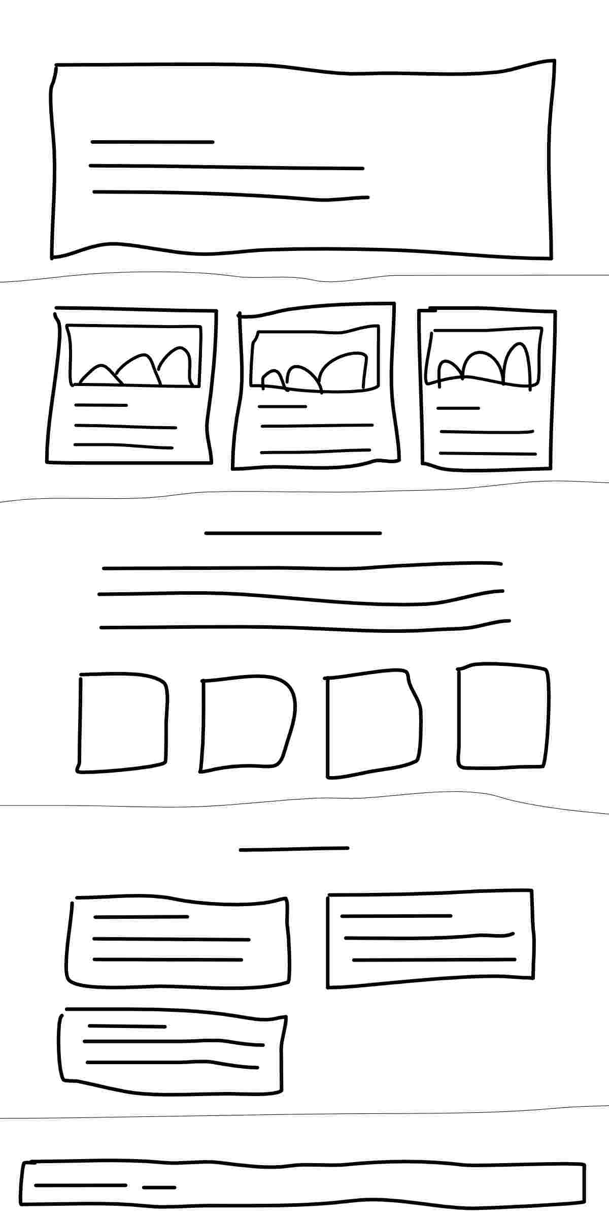
Which components do we see from top to bottom?
- Hero component: usually with a title, subtitle and background image.
- Card component: can be used to present e.g. services. Includes an image, title and description.
- Highlight component: used to highlight a specific number or target e.g. 20 coffees today, 5 releases, ...
- Article component: with a title, short description and a link, optionally with date and author.
- Footer component: Copyright and some footer links.
As you can see I drew narrow lines to indicate different sections. We'll provide a way to center the content based on a maximum width. Add a file called _mixins.scss in src/styles and insert the following content.
@mixin section-center {
    margin: 0 auto;
    padding: 0 2em;
    max-width: 60em;
    box-sizing: border-box;
}
In main.scss we can replace all styles originally placed in App.svelte with.
html, body {
    margin: 0;
    padding: 0;
    font-size: $base-font-size;
}

.section {
    padding: 2em 0;

    &__content {
        @include section-center;
    }
}
In App.svelte we already add this HTML markup as a replacement of the Svelte starter, which is roughly the structure of our wireframe.
<!-- Hero component will be placed here -->

<section class="section services">
    <div class="section__content">
        Services
    </div>
</section>

<section class="section">
    <div class="section__content">
        Highlight
    </div>
</section>

<section class="section articles">
    <div class="section__content">
        Article
    </div>
</section>

<!-- Footer component will be placed here -->
Hero component permalink
Now let’s add the Hero component. Our component will need four props: title, subtitle, imgPath and imgAlt.
To allow some flexibility in formatting the title and subtitle we’ll use the @html modifier which allows to use HTML markup in the prop value. When using this method, place the prop value between back-ticks instead of double quotes. Let’s create a Hero.svelte component file and input the code below.
<script>
    export let title;
    export let subtitle;
    export let imgPath
    export let imgAlt
</script>

<header class="hero">
    <div class="hero__content">
        <h1 class="hero__title">{@html title}</h1>
        <p class="hero__abstract">{@html subtitle}</p>
    </div>
    {#if imgPath}
    <div class="hero__graphic">
        <img src={imgPath} alt={imgAlt} />
    </div>
    {/if}
</header>
Now we’ll create a _hero.scss partial and add the following. Notice that the section-center mixing is included to center the contents of the component like we did above. Don’t forget to import the _hero.scss partial in main.scss.
.hero {
    position: relative;

    &__content {
        @include section-center;
        padding-top: 5em;
        padding-bottom: 5em;
        color: #fff;
    }

    &__title {
        margin: 0;
    }

    &__graphic {
        position: absolute;
        top: 0;
        right: 0;
        bottom: 0;
        left: 0;
        z-index: -1;

        > img {
            object-fit: cover;
            width: 100%;
            height: 100%;
        }
    }
}
Now we’ll replace our hero component comment in App.svelte with the following code. Notice the back-tics to be able to use the <br>-tag?
<Hero
    title={`Prototyping<br />with Svelte`}
    subtitle={"Easy peasy, lemon squeezy."}
    imgPath={"https://placekitten.com/g/600/300"}
    imgAlt={"It's a placekitten"}
    />
At compile time, Svelte will replace the above syntax with regular HTML.
<header class="hero”>
    <div class="hero__content”>
        <h1 class="hero__title">Prototyping<br>with Svelte</h1>
        <p class="hero__abstract">Easy peasy, lemon squeezy.</p>
    </div>
    <div class="hero__graphic"><img src="https://placekitten.com/g/600/300" alt="It's a placekitten"></div>
</header>
This component will only appear on the page once, but what if you would have a component that will be used in different places? You would have to change all the instances using find and replace. By creating a component you simply insert the component tag with the properties you need and change the component at one place.
Alright, we have ourselves a Hero. Let's move on to our next component.
Highlight component permalink
This one is small, fast to make and totally worth your time. Based on our wireframe, writing this in regular HTML it could look something like this.
<div class="highlight">
    <strong>20</strong> coffees today
</div>
<div class="highlight">
    <strong>2</strong> office cats
</div>
<div class="highlight">
    <strong>5</strong> projects
</div>
<div class="highlight">
    <strong>3</strong> conferences
</div>
Translating this to Svelte it could look something like this.
<Highlight value={20} label={"coffees today"} />
<Highlight value={2} label={"office cats"} />
<Highlight value={5} label={"projects"} />
<Highlight value={3} label={"conferences"} />
Create a file called Highlight.svelte in src/components with the following code.
<script>
    export let value;
    export let label;
</script>

<div class="highlight">
    <strong>{value}</strong> {label}
</div>
Next create a _highlight.scss partial in src/styles with the following Scss. Again don't forget to import it in main.scss.
.highlight {
    font-size: 1.5rem;
    text-align: center;

    strong {
        font-size: 3rem;
        display: block;
    }
}
We want to make the highlights appear next to each other by four just like in the wireframe. Add the following styling in main.scss. In case you're not familiar with CSS grid, it's totally worth looking into.
.highlights {
    display: grid;
    grid-template-columns: repeat(4, 1fr);
    grid-column-gap: 2em;
}
And finally place the following code in App.svelte.
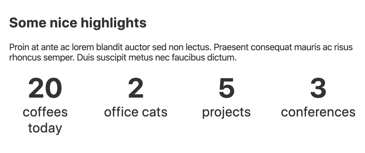
<section class="section">
    <div class="section__content">
        <h2>Some nice highlights</h2>
        <p>
            Proin at ante ac lorem blandit auctor sed non lectus. Praesent consequat mauris ac risus rhoncus semper. Duis suscipit metus nec faucibus dictum.
        </p>
        <div class="highlights">
            <Highlight value={20} label={"coffees today"} />
            <Highlight value={2} label={"office cats"} />
            <Highlight value={5} label={"projects"} />
            <Highlight value={3} label={"conferences"} />
        </div>
    </div>
</section>
Our highlights section should look like this!
Wonderful! Our one-pager is already coming along just fine.
Card component permalink
Let’s get working on the card component. Create Card.svelte and place this in it.
<script>
    export let title;
    export let description;
    export let src;
    export let imgAlt;
</script>

<article class="card">
    <img {src} alt="{imgAlt}” />
    {@html title}
    {@html description}
</article>
The code above would limit us to just 4 props and some flexibility with the @html modifier. To create greater flexibility, we could use a slot. This allows us to make the card contain anything we want.
<article class=“card”>
    <slot></slot>
</article>
Using the slot we could add. The content inside the Card tag will be placed inside the slot-tag of our component.
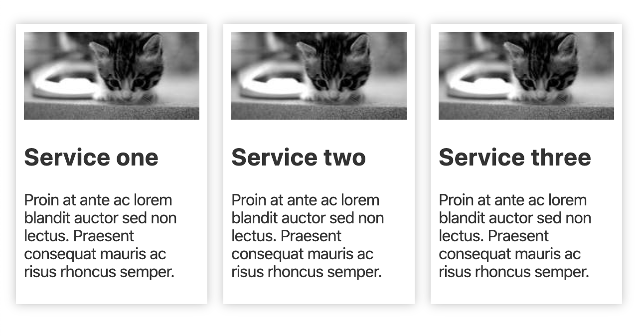
<Card>
    <h2>Service one</h2>
    <p>Proin at ante ac lorem blandit auctor sed non lectus. Praesent consequat mauris ac risus rhoncus semper.</p>
</Card>
<Card>
    <h2>Service two</h2>
    <p>Proin at ante ac lorem blandit auctor sed non lectus. Praesent consequat mauris ac risus rhoncus semper.</p>
</Card>
<Card>
    <h2>Service three</h2>
    <p>Proin at ante ac lorem blandit auctor sed non lectus. Praesent consequat mauris ac risus rhoncus semper.</p>
</Card>
Next we create the partial _card.scss and of course import it in main.scss.
.card {
    padding: .5em;
    box-shadow: 0px 0px 10px 0px rgba(0, 0, 0, 0.25);
    display: block;

    img {
        width: 100%;
    }
}
Finally we want to display our cards as presented in our wireframe, so we add the follwing in main.scss.
.services .section__content {
    display: grid;
    grid-template-columns: repeat(3, 1fr);
    grid-column-gap: 1em;
}
Hooray! We now have our cards section.
Coming along just nice isn’t it? Let’s work on the last 2 components: Article and Footer.
Article component permalink
Article is very simplistic, simply have a title, short description and link.
<script>
    export let title;
    export let href;
    export let description;
</script>

<article class="article">
    <h2><a {href} {title}>{title}</a></h2>
    <p>{description}</p>
</article>
Create the partial _article.scss. The trick with the after pseudo element is making sure the whole article is clickable, by positioning it absolute to cover the entire .article that is set to relative positioning. Oh and don’t forget to import the partial in main.scss.
.article {
    position: relative;

    h2 {
        line-height: 1.4;
        a {
            text-decoration: none;

            &:focus,
            &:hover {
                text-decoration: underline;
            }

            &::after {
                content: "";
                position: absolute;
                left: 0;
                top: 0;
                right: 0;
                bottom: 0;
            }
        }
    }
}
We want to display the articles just as in our wireframe. So we'll need to add some styling in main.scss to make that happen.
.articles .section__content {
    display: grid;
    grid-template-columns: repeat(2, 1fr);
    grid-column-gap: 2em;
}
An all this gives us a nice result.
Now there is one thing left before we're completely finished.
Footer component permalink
The footer component is for this example as basic as it gets. A copyright mention and some footer links. The links will be an array which contains objects per link.
Create Footer.svelte in src/components and add the following. You'll notice we perform a check if links are present and if they are we loop over each item.
<script>
    export let copyright;
    export let links;
</script>

<footer class="section footer">
    <div class="section__content">
        {@html copyright}
        {#if links}
        <ul class="footer__links">
            {#each links as { title, href }, i}
            <li class="footer__link-item"><a {href} {title}>{title}</a></li>
            {/each}
        </ul>
        {/if}
    </div>
</footer>
Create the partial _footer.scss and add some basic styling. Oh, the * + * is called the owl selector. What this basically does is to apply styling to each element that is preceded by another element within a set of elements.
.footer {
    &__links,
    &__link-item {
        margin-left: 1em;
        padding: 0;
        list-style: none;
        display: inline-block;
    }

    &__links > * + * {
        margin-left: 1em;
    }
}
Now to finish this, all we have to do is add our Footer component to App.svelte et voila!
<Footer
copyright={"Copyright © John Doe"}
links={[{ 'title': 'Disclaimer', 'href': '#' }, { 'title': 'Cookies', 'href': '#' }]} />
That’s it! You have finished the entire wireframe introduced in this post. The end result should look like this.
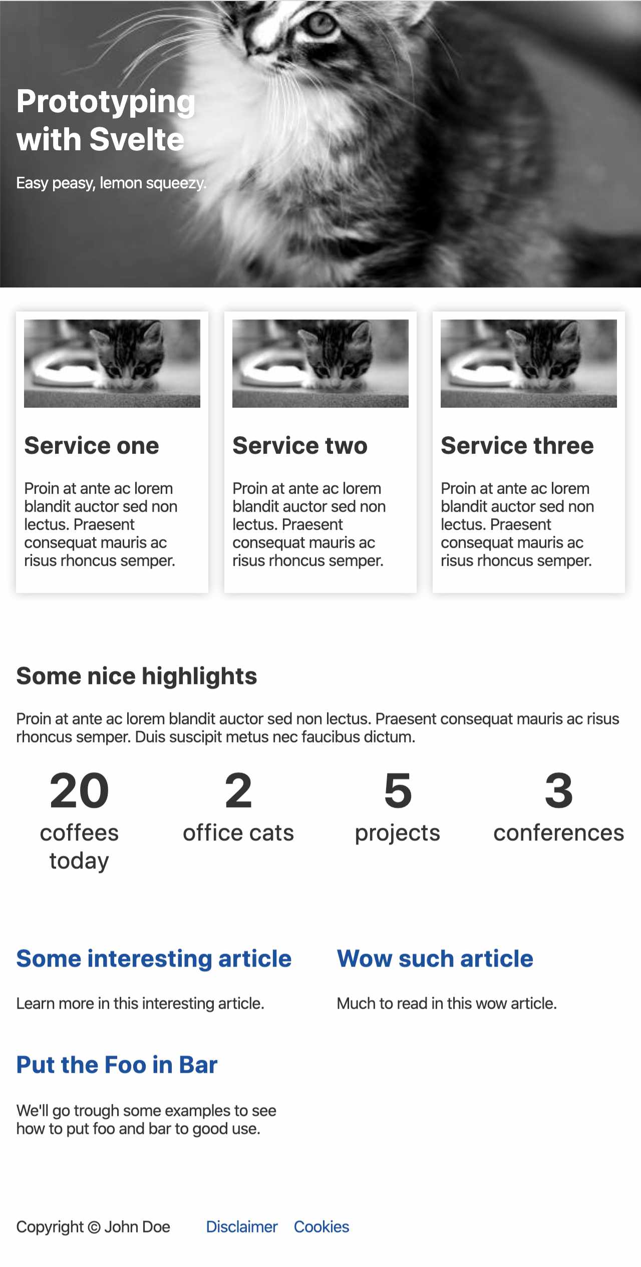
This codebase should give you a head start to start prototyping many other components and different sets of pages.
I used this approach to build a production ready one-pager for the .Script guild of Continuum Consulting NV.
Is there more to Svelte? permalink
There sure is. If you’re looking for routing, service worker integration and server-side rendering, I strongly suggest you check out Sapper.
Will I be using it in the future? permalink
I love Svelte for fast prototyping, it allows me to create reusable components (with Sass) in languages I already know and the learning curve is not steep at all. For more complex behaviour there is Sapper with Service Worker integration, Server Side Rendering, and more. So yes, I will probably use it more in the future.
Resources
- Svelte: https://svelte.dev/
- Sapper: https://sapper.svelte.dev/
- CSS Grid CSS Tricks: https://css-tricks.com/snippets/css/complete-guide-grid/
- CSS Grid Generator: https://cssgrid-generator.netlify.com/
- CSS Grid Garden: https://codepip.com/games/grid-garden/
- Owl Selector: https://alistapart.com/article/axiomatic-css-and-lobotomized-owls/
- Atomic Design: https://atomicdesign.bradfrost.com/
- BEM: http://getbem.com/